We have made no secret about being fans of Stephen Few, linking to his blog and other work at least once a week.
Well a recent post by Few posted, in full, an argument made against his book by a claimed data visualization expert, Dennis Ross.
As fans of Few, of intellectual discussions about data visualization, and the importance of open opinions on these topics, we thought it was worth replying directly to Ross's points.
Ross's arguments against Few's book:
1. It's too academic.
Well the purpose is to put academic discussion behind visualization, and go beyond the "it's pretty!" analysis, right?
2. You can't tell clients they can't have what they want.
I don't think Few says that specifically, like, "I refuse to make a gauge". t's like survey, you give clients the best info you can, and then let them make their own decision. I totally disagree with just lying down and never giving a counter example. This was where the guy got insulting, and lost all credibility for me).
3. Bullet graphs suck, and are confusing to me.
In the right circumstance, they are good options. And just throwing out any chart form as too confusing is short-sighted, as there is almost always a perfect situation for any chart. Even a conical chart, always awful, could be useful to show how much of a cone has been constructed, right? And, if you only saw bullet graphs daily, they would make far more sense.
Perhaps I disagree with Few on the relative advantages and disadvantages of bullet graphs, pie charts, and bubble charts, though we all (I think) agree that it comes down to choosing the right graph for the data, and what you're trying to see.
4. Few's a douchebag because he hates Oracle/Xcelsius/etc.
Alongside this excellent point, some sub-arguments:
A. Tableau is ugly
So are you! See, I can make arguments that don't have reasoning too. And regardless of your opinion of the look of Tableau, it's more about the concept of visualizing complex multi-dimensional data. And visualizing it in a way that allows users to manipulate and adjust dynamically.
B. Oracle/Xcelsius are fine because they "can be improved, yes, but they are light years ahead of what we have been working with in the past 10 years."
Really? It's not OK to criticize because at least it's better than before? That's great. "Hey Iraqis, stop complaining, at least your government is better than it was 10 years ago!"
C. Oracle/Xcelsius "exist to serve customer or client needs, NOT Few’s design sensibilities."
Once again, this is the terrible POV that represents some of the worst areas of complacency in business. It is not an example of pig-headedness, or douchebaggery: it's actually a matter of personal responsibility. If I go into a restaurant and pick a sandwich off the menu that the server (a) thinks isn't very well made, (b) knows gets a lot of complaints, and (c) has a far superior, but similar, alternative in mind, she should tell me. In fact, the restaurant should probably stop including that sandwich on their menu in the first place.
But yes, if after all of that information is given, I still want my terrible sandwich, then the restaurant should probably make it for me.
(Speaking of, I have had several of my favorite meals taken off the menu of one of my favorite restaurants. I'm not sure what that says about me....)
**************************************************
As Few did in his posting, here are detractor Dennis Ross's sample dashboards.
Posted without comment.
We in this field of interest can freely disagree, but it is the arguments and defense that keep it strong. And it is only the strong arguments and defense which continue to advance the technologies we rely on (Tableau, Oracle, Xcelsius). Think of the amazing improvements between the oft-maligned default charting and color schemes of 2003 Excel, to the 2007 versions. And as people continue to discuss and debate Excel 2007's graphs, these will come in to making their future versions even better.
In short, by defining the entire visualization software discussions and debate as unnecessary, and those that ask for better as "douchebags", you are doing a great disservice.
**************************************************
This was a fantastic end quote from Few which I will undoubtedly use again:
"Keep giving your customers what they want, even when it doesn’t work, rather than taking responsibility as a consultant to add value. That may satisfy them for the moment, but it won’t help them in the least."
Friday, May 21, 2010

Thursday, May 20, 2010
Wednesday, May 19, 2010
The Old Days of Web Design
Remember Geocities? Every other page had one of those running dogs, or the blinking Under Construction site, or similar? Well, now you don't have to!
In fact, I encourage you now to reload this blog in what is, inarguably, a better format. Here you go!
As the Onion AVClub would say, "Great job, internet!"
In fact, I encourage you now to reload this blog in what is, inarguably, a better format. Here you go!
As the Onion AVClub would say, "Great job, internet!"
Tuesday, May 18, 2010
Dashboard Critique - Part Two
Work has finally died down enough to continue with the Dashboard Critique series that was started in Part One. If you remember, we were looking at this post from Dan, showing a company's Flash-based dashboard product.
In Part One, I talked about the left side of the dashboard, from the teeny-tiny column charts, to the mastery of white space misuse that was the Traffic Light "chart".
In this next part, I'm going to discuss the upper right corner of the dashboard. They're a little more boring in the scheme of things, but that just sets us up for the pure excitement of Part Three (tentative title: What is the most misleading chart ever, the cone chart or the 3-D ring?).
So here we go!
**********************************************************
The first chart is this yawn-inducing spreadsheet on the top middle:

Now, this is an interesting case, because I'm not one to say that EVERYTHING must be in graphs and charts. This is definitely the best way to show this detail, which is probably on the dashboard because it's very important to this theoretical client. Let's assume this, for sake of argument!
Let's also cover the other good things. I like the immediate red visualization for high risk. I like that some of the entries seem to be links (again assuming they are links, and not just text with underlined font). It appears I can filter. The rows are colored gray/white, making them easy to follow.Now, the bad. In the spirit of this non-visualization, I'll do it in list form:
If you look worse than what comes in default Microsoft Office settings, you have a problem.
I'm going to get that embroidered on a pillow.
**********************************************************
OK, this next one's gonna be easy. This is arguably the biggest visual punch of the dashboard, so it must be great, right? On the upper right corner:
 It took me a while to figure out what this graph was trying to show us. I get it now - the "general budget trend" is at -$37,000 (uh oh!), and if negative it's in the red, and positive in the green. Simple. One number, is it positive or negative.
So why is it so big???
And, if it's so big, why is the Main Point Of All This, the where you are now (-$37,000), so small?
There's not much to say that isn't terribly obvious here. I'm guessing the makers of this demo dashboard figured they needed a non-gauge gauge here. But this is basically a horizontal gauge. Not that there's anything wrong with that! It's just so poorly executed in this case....
Now in Part 3, we will be talking about the gauge on this dashboard, so they'll be plenty of time for that. My main problem with gauges is that they show so little for so much space. Though this graph sure proves that it can be worse!
Now, there's something to be said for a non-circular display (an issue with gauges), especially for postive/negative financials. And the real estate this should take up is relatively small, compared to a gauge. So if they had slimmed down the height of this bar, and put about 3 or 4 in this module (say, last month's average, last year's average, etc. - whatever's important.)
Part Three's discussion of gauge's sure will be fun!
**********************************************************
Moving on to, unfortunately, another yawner. This non-chart:

I've gotta say, this was another one that made me scratch my head as I tried to figure it out. And let me say, I still have absolutely no idea. Seriously. If you know what this is showing, let me know in the comments!
I'll tell you what it looks like went wrong here. The legend was so big, and the labels were so long (and shifted 180 degrees didn't give much room there), and the title, "Value of 0 = project on target", so long, that the actual visualization got smooshed and smooshed down into a tiny little space. I believe that might be a line chart, or perhaps an area chart? That's my best guess.
But wow, did this one screw up. (Remember, we got this out of marketing material for a data visualization company, believe it or not.)
Fix it. Change the legend to be in a box on the side, or remove it all together (have a button that will bring it up, add labels to the chart, add mouse-over tool tip info about what you're looking at - these are all non-default options that would be better. Just fix it, move things around, until you can actually see the data! Take the labels out of 180 degrees, and flip them to normal.
Oh, and those colors all look alike in the legend. You can't do that. Even if we could see the graph itself, this sure wouldn't be useful in any way.
**********************************************************
I think what has surprised me in this world of dashboards, having been working with data visualization as much as I have as an analyst, is how much people take the default that's given to them. If you wouldn't put it in a presentation, then it shouldn't go in a dashboard. You should be able to fix size, colors, text, font, etc. in a dashboard as much as you can in standard-issue Excel.
Remember:
I'll send pictures of my embroidered pillow when it's done.
Part Three, coming soon!
In Part One, I talked about the left side of the dashboard, from the teeny-tiny column charts, to the mastery of white space misuse that was the Traffic Light "chart".
In this next part, I'm going to discuss the upper right corner of the dashboard. They're a little more boring in the scheme of things, but that just sets us up for the pure excitement of Part Three (tentative title: What is the most misleading chart ever, the cone chart or the 3-D ring?).
So here we go!
**********************************************************
The first chart is this yawn-inducing spreadsheet on the top middle:

Now, this is an interesting case, because I'm not one to say that EVERYTHING must be in graphs and charts. This is definitely the best way to show this detail, which is probably on the dashboard because it's very important to this theoretical client. Let's assume this, for sake of argument!
Let's also cover the other good things. I like the immediate red visualization for high risk. I like that some of the entries seem to be links (again assuming they are links, and not just text with underlined font). It appears I can filter. The rows are colored gray/white, making them easy to follow.Now, the bad. In the spirit of this non-visualization, I'll do it in list form:
- The biggest issue - that tiny horizontal scroll bar. I think if I scrolled to all the way to the right, that 5% extra space would show the rest of the Response column. They should have tried to fit it all in one horizontal view, which seems possible with the current choices. Having both horizontal and vertical scroll bars is a pretty big no-no.
- Part of #1's issue is that maybe this is just too small a space for so much information. Twice the width would pretty much solve your issue, and make this readable. And allow some of the other issues I'll go into in the next points to be solved.
- I need a chart like this to see a lot of different things at once. This also applies vertically. That text wrapping is making every row super-wide, so I can only see 2 of 46 in this view. Take out text wrapping that interferes. You can substitute the text wrapping by letting me mouse over and see the full text, for example. And/or allow me to click to pull the entire chart into a pop-up window. You have to think smarter than default.
- We all work with spreadsheets and charts all the time nowadays. I need to be able to sort and filter by column headers.
- Speaking of, either give me good, sensical column sizes, or allow me to change the sizes myself. (Though please save my settings if that's the case...) Why is the Milestone column width the same as the Issue column width?
- Though charts don't need borders around every cell, this needs something more than what they have. Very narrow and light vertical column separation, for example. Or better control of the internal margins of the cells (you can change the default settings, you know...). Or use more horizontal centering of cell content that isn't a long sentence. Something. That Action column's text is practically covering up the Response column!
If you look worse than what comes in default Microsoft Office settings, you have a problem.
BE SMARTER THAN DEFAULT
I'm going to get that embroidered on a pillow.
**********************************************************
OK, this next one's gonna be easy. This is arguably the biggest visual punch of the dashboard, so it must be great, right? On the upper right corner:
 It took me a while to figure out what this graph was trying to show us. I get it now - the "general budget trend" is at -$37,000 (uh oh!), and if negative it's in the red, and positive in the green. Simple. One number, is it positive or negative.
So why is it so big???
And, if it's so big, why is the Main Point Of All This, the where you are now (-$37,000), so small?
There's not much to say that isn't terribly obvious here. I'm guessing the makers of this demo dashboard figured they needed a non-gauge gauge here. But this is basically a horizontal gauge. Not that there's anything wrong with that! It's just so poorly executed in this case....
Now in Part 3, we will be talking about the gauge on this dashboard, so they'll be plenty of time for that. My main problem with gauges is that they show so little for so much space. Though this graph sure proves that it can be worse!
Now, there's something to be said for a non-circular display (an issue with gauges), especially for postive/negative financials. And the real estate this should take up is relatively small, compared to a gauge. So if they had slimmed down the height of this bar, and put about 3 or 4 in this module (say, last month's average, last year's average, etc. - whatever's important.)
Part Three's discussion of gauge's sure will be fun!
**********************************************************
Moving on to, unfortunately, another yawner. This non-chart:

I've gotta say, this was another one that made me scratch my head as I tried to figure it out. And let me say, I still have absolutely no idea. Seriously. If you know what this is showing, let me know in the comments!
I'll tell you what it looks like went wrong here. The legend was so big, and the labels were so long (and shifted 180 degrees didn't give much room there), and the title, "Value of 0 = project on target", so long, that the actual visualization got smooshed and smooshed down into a tiny little space. I believe that might be a line chart, or perhaps an area chart? That's my best guess.
But wow, did this one screw up. (Remember, we got this out of marketing material for a data visualization company, believe it or not.)
Fix it. Change the legend to be in a box on the side, or remove it all together (have a button that will bring it up, add labels to the chart, add mouse-over tool tip info about what you're looking at - these are all non-default options that would be better. Just fix it, move things around, until you can actually see the data! Take the labels out of 180 degrees, and flip them to normal.
Oh, and those colors all look alike in the legend. You can't do that. Even if we could see the graph itself, this sure wouldn't be useful in any way.
**********************************************************
I think what has surprised me in this world of dashboards, having been working with data visualization as much as I have as an analyst, is how much people take the default that's given to them. If you wouldn't put it in a presentation, then it shouldn't go in a dashboard. You should be able to fix size, colors, text, font, etc. in a dashboard as much as you can in standard-issue Excel.
Remember:
BE SMARTER THAN DEFAULT
I'll send pictures of my embroidered pillow when it's done.
Part Three, coming soon!
Sunday, May 9, 2010
Big BI
"no interface, no matter how magical, will give you access to data that isn’t available, will clean data that is dirty, or will simplify the navigation of complicated operational databases." - Stephen Few
Friday, May 7, 2010
Monday, May 3, 2010
Bad Use of Pie Charts
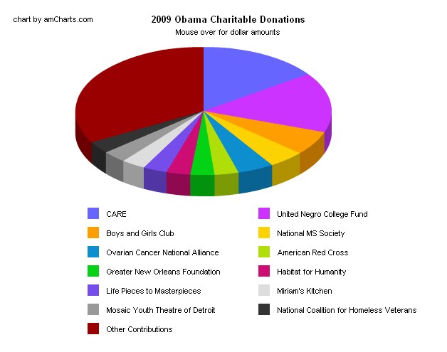
While we all agree that pie charts can be useful, I noticed on AOL's "The Grid-News by the Numbers", a pie chart breaking down Obama's charitable donations. There were 13 slices of the pie, which made it too much cognitive work to match the colors to the slices, not to mention trying to decipher the differences between a slice that represents 3.04% of the whole and a slice that represents 4.0%. I think a bar chart would have been much more visually effective.
http://www.aolnews.com/the-grid/article/tax-return-shows-obama-familys-favorite-charities/19443320
Subscribe to:
Posts (Atom)